The composition of colors, contrast, balance, symmetry, asymmetry, proportion, rhythm, proportion. All these need to be considered in decorating the house, establishing relationships with various effects between flat surface stains and spatial elements, creating different compositions.
In any artistic creation in the planning stage, the composition actually means clear organization of the various elements that compose it. In the interior decorating we can create balance and harmony through the subdivision of flat surfaces (floors, walls, ceiling).
In Dutch painter Piet Mondrian paintings (1872-1944) we see many opportunities and variants of subdivide surfaces. For color balance and subdivision of surfaces, the artist resorts to the rules of the golden section – the system of colors and lines of Mondrian’s paintings takes effect in the context of positive-negative opposition.
The painter Victor Vasarely, representative of the famous current “Op Art” (“optical art”), relied on a similar system when he divided and designed the space of his paintings belonging to several series of creations painted in this style.
When we put paintings on the walls of the house, they must be placed under the rules of optical balance. A few tips for placing paintings:
A small painting with fine drawing (graphics, engraving on copper, photo) must be placed in a place accessible to us (about 40 inch tall), being under the average height of the visual field (63 inch).
A big picture with a strong expression must be placed at a certain distance from the viewer, as it has a bigger “irradiation” than a photo.
The color of the painting, the effect or the picturesque can influence the space ambiance, something that absolutely must be taken into account during the arrangement of the space.
The painting of small or medium size has the desired effect only if his middle fragment(central) is at the height of our visual field (approx. 63 inch).
If the wall is decorated with a strident model, it is advisable to use a wider passe-partout; in this way the colors and fine lines of the painting will not be “jammed” by the drawing of the wall.
Also these should be considered: architectural dividing of the wall surface, the upper edge of the doors, the horizontal divisions of the built closets or even the jamb of a fireplace.
Do notplace large paintings above smaller paintings.

The paintings of different sizes should be arranged considering certain horizontal and vertical coordinates.
Place the paintings so that their bottom edge to be along the same line; keep in mind that the human eye is more sensitive to horizontal split. If the subdivided lines are unitary, the relationship between them is obvious and creates a feeling of calm.
The proportions of the space can be improved also with the help of paintings, for example by optical correction. The paintings that are in a horizontal sequence can widen the wall, in vertical accentuating its height. A larger painting with strong colors, placed on the wall of a narrow room, apparently shortens the space.
CONTRAST EFFECTS IN THE INNER SPACE
We can realize very easily that the interior forms – which are different between them in terms of the contour, of the material used and the size – influence each other: they blend harmoniously, or, otherwise the whole picture falls apart.
Interior design conscious recourses to the use of contrast effects. The furniture and other decoration objects must be reported – weight, contours and by their formal nature – not only to each other, but also to the architectural space that houses them, more precisely the size, proportions and dividing interior thereof.
T. Conran, a famous interior designer, emphasizes in several of his works, how important it is to find, to the arrangement of rooms, a focal point to attract the eye. Contrast effects helps to identify or form the focal point.
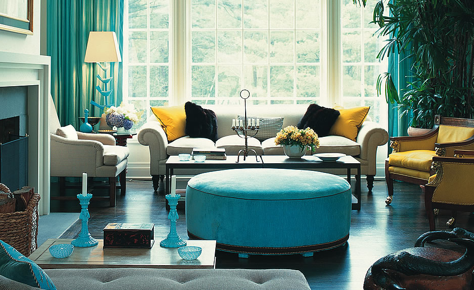
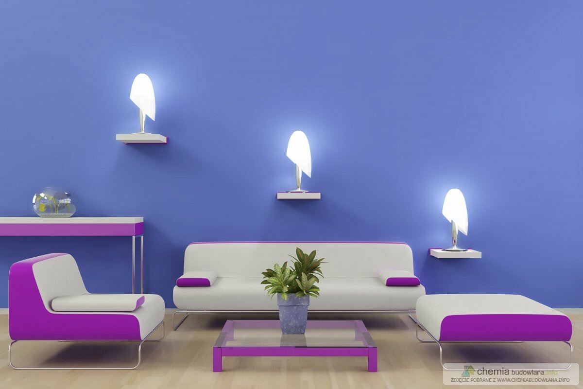
One possibility in this regard is represented by the contrast of forms: the ensemble composed of a round object and one with corners. This can be made easily in the living room arrangement – to think about the arched contours of chairs and seats, respectively the straight lines of the storage furniture.
It can not be neglected the psychological effect of forms. We feel that small objects are delicate, large ones are strong, the thin ones are fragile, while thick ones are stable, regardless of what material they are made of. Another possibility is placing face to face a big object and a small one: the contrast of sizes.
Small furniture can be showed off, being accented by large furniture, located next to it. Aesthetic impression stems from underlying oppositions. While notification to the contrast of sizes and shapes is possible visually, the materials contrast can be perceived only by touch.
Most of our usual objects must be pleasant to the touch, smooth and warm, at least those parts of them that we come in contact. We can use rough surfaces, colder to the touch (raw brick, stone wall) in the case of a large space, where the walls are far from the action zones.

On the other hand, if the space is poor in stimulus, housing smooth, flat furniture, forms a sterile environment. It requires adequate contrasts in terms of individual and functional perspective, especially in an arranged space. The simplest way of highlighting the focal point is perhaps lighting. Lighting an object serves to highlight it, distinguishing it from its environment.
DISPATCH, PROPORTION, SYMMETRY, ASYMMETRY
“What a disproportionate room! The wardrobes are so high and the room so small!” – Are remarks that we heard or we said ourselves, frequently.
One of man’s innate capabilities is to recognize the correct proportion. This means reporting. If something is disproportionate, it is, in fact, small, large, wide or narrow compared to the optimal size.
This reporting is done by human in close contact with himself. Protagoras, philosopher in ancient Greek, is the one that launched the phrase “Homo mensura” meaning “man is the measure of all things.” This statement is still valid today, because the reporting base can consist only in human dimensions. If we say about a chair that is very disproportionate, we consider so, relating it to our own measures.
The interior that provides a genuine feeling of comfort is both beautiful, meaning aesthetic, and successful, in other words corresponding to intended use.
The preliminary condition of this sensation is the well proportioned placement of furniture, using proportional pieces, with functional comfort factors, adequate for purpose. If the basic proportions are wrong, also the carefully crafted details become useless.
Not only music and dance can have rhythm. It is also used in applied art, which is one of the essential means of expression. In art of decorating, rhythm means the proportional arrangement of spatial or plane elements. We say, for example, that chandeliers have a good rhythm.
The big repetition in nature is represented by the seasons. On finding the rhythm, the measure is again the human. We are not able to sense repeating too fast or too slow. In general, the pace provides a soothing sensation, that of order.
Human feeling of comfort increases with the possibility of appreciation. But the overemphasis of rhythm can become boring, mechanical (building facades of current cities neighborhoods).
Symmetry is one of the factors of organization of the universe. In the organic world and the inorganic one, we find countless examples of symmetry. This means accentuated proportionality, symbolizing the immutable order. In many cultures it blends with the notion of harmony, beauty and perfection.
The ancient Greeks believed that perfect and symmetrical shapes are the circle (in plan) and sphere (in space). If we think of the history of architecture, we see that for buildings of classical periods – not only if the facades, but also in space arrangement – symmetry was used as a model for design.
Classic examples reveal also the fact that if they wanted to draw attention to one aspect or object, they placed it according to the symmetry axis. This axis of symmetry can be also the focal point. Our general household items, most of the furniture we use, are also symmetrical.
But rigid symmetry can have an effect of solemnity and exaggerated picture. In this way, it rarely corresponds to the intimate ambience of the house. Therefore, sometimes it is necessary a certain asymmetry, we need irregularity, controlled asymmetry.
The slightly irregular symmetry can make the spaces more vivid, according to human scale. In an arranged space, asymmetry highlights what is to accentuate, thus becoming the focal point of the space. In this case, we must be careful in balancing.
Using asymmetries for their mutual balancing can cause the same feeling of accomplishment that ensure the symmetrical composition. In arranging the house, the balanced asymmetry gives a more alive aspect to the arranged space.
For decorating the surfaces, the materials are adorned with various models. These ornaments imitate natural materials (wood, stone, textiles) or provide organic, geometric or abstract models to the materials surfaces.
Because printing patterns is made by laminating, they repeat, in general (thus entering in a rehearsal report). In our environment we find a large number of such materials; is enough to think of the wallpaper, the curtains and patterned carpets or furniture that mimics the nervure of wood. Using models we can totally modify the proportions, the style and character of a room.
It can be seen that the materials in dark, warm colors with dense and big model narrows the room, giving the impression of an enclosed space. Instead, the bright materials, with relaxed, fine model, widen optically the room. The type of the model and the amount of the succession, must be in accordance with the size, proportions and destination of the room.
Materials with large models and with strong contrasts “choke” the small, closed space. The features of a finely patterned material, low in tones, do not manifest in a large space.
In decorating the house we should not forget the texture, namely the surface appearance of the materials. A particular model can be matched to a material and look terrible on another’s surface (for example: brick pattern on fabric or wood pattern on metal).
The pattern of materials and their surface appearance, the texture, are also correlated. The vertical lines accentuate height, while horizontal ones have a widening effect. The wall on which it is applied, from the middle down, a certain model, and also high pedestal broaden the room optically, and emphasized lined model, applied over the height of eye, draws up the eye, because of the telescoping effect.
Did you like this article?
Subscribe to our RSS feed and get more design stuff!


Leave a Reply